Running Shorts: Smashrun to get running smart
A few months ago, a good friend of mine, you have probably heard of him in the Journey to 100-mile series runners profile, Jamie recommended that I check out the website/app Smarhrun.
In a nutshell, Smashrun is a website/offering that, after linking and syncing to your Strava or Garmin Connect data, will help runners take a different look at the data, track and analyze their running activity. My first impressions were, WOW! Although it might look very busy at first glance, once you get past the busyness, there is a lot of great information that will help you take a different look at your runs and performance and perhaps help you in future events or training runs. In my opinion, I think it is a great tool for runners to add to their data analytics toolkit because it provides many useful features that can help them find areas to improve their performance and reach their running goals. Some of the benefits of using Smashrun that I quickly was able to gather with a fast quick glance include:
Smashrun integrates with fitness apps and devices, allowing runners to track and analyze their activity from various sources. It is very easy to set up, and after waiting to upload some of the historical data, there was a lot to see. Making it easy to keep track of all of their training data in one place. Although, you might need to spend some time tagging at least some of the key runs, like events (races) and the type of surface, there is a general view where you can see all the historical, and a run view, where you can see a specific distance run and the comparison.
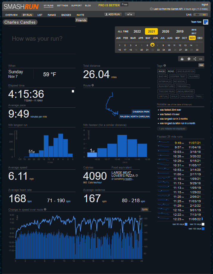
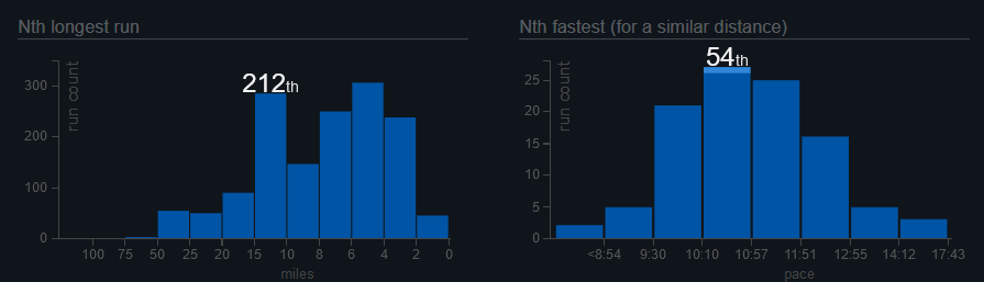
That last view, which I found useful, will allow you to track your runs providing a detailed analysis of their performance, like calories, distance, pace, elevation, and splits in a simple visual/table. I know you can find that information in many other tools, but one thing that is helpful is that on the lower right side, you will find a list of the runs with the same distance in the order of performance. Which will allow you to compare, analyze, help with setting goals and track your progress over time.
Highlighting the current/ most recent run and how it compares to other same mileage runs, like standing spot Top, Mid, or slower than. It also will let you know how long ago those runs were. Giving you perhaps an insight on whether the faster you is in the past or if there is any glimpse of hope to retain some of the speedy pace in the near future. That especially handy for older runners like me. (What am I saying, old?!! I am very young in running years or is it miles?)
There are a couple of handy histograms where you can see what are basically your favorite or common distances. As well as the most common paces based on your activities. This information you can find in the run view in which it will also highlight the value of the current one and how it lands in the histogram.
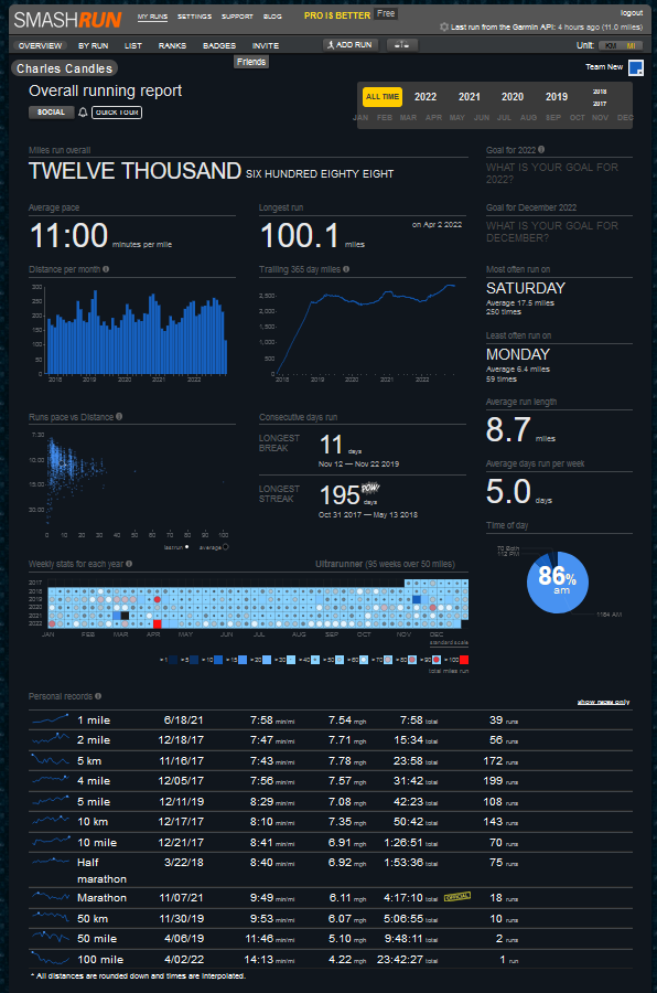
At the general overview page, you will find a history of weekly mileage going back a few years (2017 for me). From that view, I can gather that I definitely do not do many low-mileage recovery weeks (Darker Blue). I can also see that the February-March and then again picking up in September-October most recently timeline is where I tend to do the higher distances, with the exception of 2021.
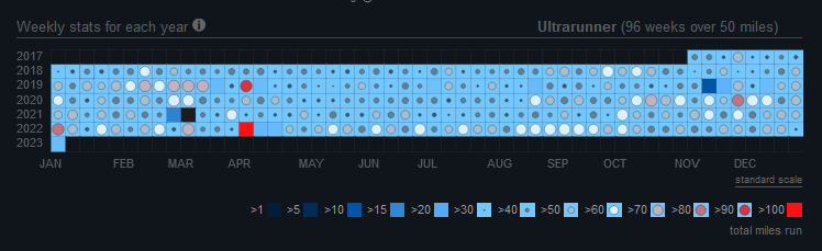
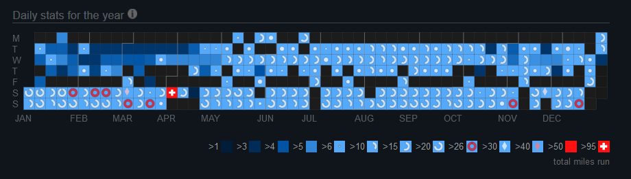
In addition, you can also just get the year view by day of the week. Which also provides me with some notable insights. Monday is my mostly non-running day, mostly black and very dark blue, nothing that I do not already know. But then it is followed by low mileage on Tuesday and Wednesday but only in the early part of the year. Also, my preferred back-to-back long run over the weekend can easily be seen as a constant 3/4 to full circle icon. Especially heavy from January to early April as I was training for a 100-mile event.
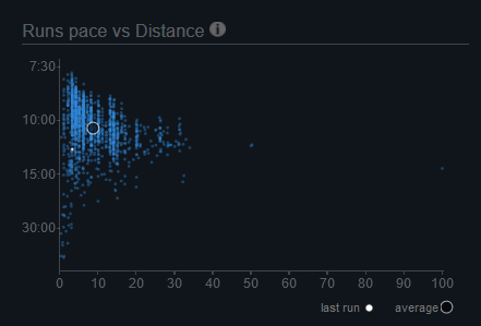
There is also another handy funnel shape chart where you can see the average pace of the runs at different distances. there is a big spread of paces the shorter the distance, and it starts to narrow the range the farther you go out (Longer the distance) this could be due to the less amount of longer runs, but also the variability of effort is reduced the longer the run. Given that for us mortals, running ultramarathon distances every week with different range of efforts is not necessarily a healthy or optimal option. But it does nicely showcase some of the global data trending averages of pace performance. Although you can get the same view for a specific year, I think it would have been nice to see a year-after-year comparison of the overall performance average pace and comparison and indication of progress or sustaining performance condition—just a thought.

Similar to other social apps and sites, Smashrun allows you to add your friend creating a sub-community to share runs and connect. Once having a friend, you will be able to see similar information and learn additional details from other runners to consider. I only have a few friends added, and I have yet to explore much of this, but I can see some that perhaps can help if there are shared segments or distances. Also, to keep you engaged, there are a set of badges you can earn and collect to showcase in your profile. More for me to explore in this area.
There is a free and a pro version of the data, views, badges, and other capabilities. I am currently exploring the free version, but I am curious to learn more and see what the pro version can provide. There is also a Smashrun blog where the creators share great details, tips, advice, and information. Now with all that said and done, I am still figuring out how to use this new set of views and data to adjust, plan or get ready to increase and improve performance.
Overall, I think there is still so much to explore with Smashrun. The different views of the data you can gather can provide some insights that could have been a little bit difficult with other tools. Definitely, it can help you dice the data in different and insightful ways and could help runners of all levels to track and improve their performance.